There’s no point in running… In your production resources, in your production orders, among your suppliers, you have hares and tortoises. The trick is to get there on time (yes, I know, that’s not the original moral). This is what is measured by the most important supply chain performance indicator for the supply chain: the service rate — with some variations in calculation depending on the company — service rate, on-time delivery (OTD), OTIF, call it what you like, but make sure it comes as close as possible to 100%.
How can OTD be improved?
The service rate is the result of processes, decisions, and hazards. It is the final judge of a company’s ability to meet demand. Designing a relevant management model, positioning the right stocks in the right place, capacity management, developing supplier performance, improving equipment reliability, and reducing non-quality all contribute to improving OTD. But when the results don’t live up to expectations, how do you define the priorities for action?
Controlling Time with Time Buffers
To improve on-time delivery (OTD) and initiate its improvement process, the Theory of Constraints recommends the reasoned use of time buffers. In particular, we always position a time buffer at the end of the process, before dispatch to the customer or before putting it into stock.
A time buffer is a safety margin built into the flow — into the routing of the manufactured item. For example, we’ll set a time buffer of three shifts before dispatch. This means that we aim to finish manufacturing the products three shifts before the promised dispatch date. If we work 3×8, we aim for 24-hour availability.
In addition, we divide this safety into three zones: red, yellow, and green.

In this example, each zone represents a third of the time — an 8-hour shift if our buffer is 24 hours. These sets of colors make it possible to visualize priorities without ambiguity, and we must associate actions with them:
- What should you do if the product is not yet available in the yellow zone?
- What action should be taken if the product is not yet available in the red zone to avoid it being late?
Drive Continuous Improvement
An OTD measure counts the percentage of lines delivered on time. It’s binary: good or bad. However, when using a time buffer, we can measure something more circumstantial: in which zones of the time buffer do we receive the products?
We can now analyze the consumption of our end buffer, and the characteristics of orders arriving at the end of the buffer or late — are they, for example, orders passing through a specific production resource?
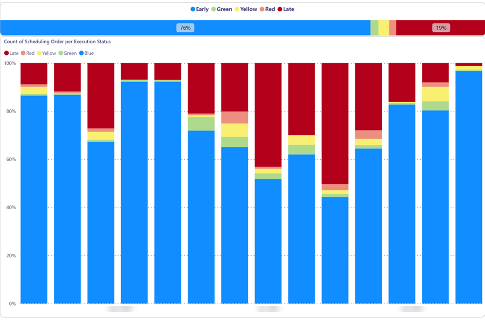
Many orders may arrive in the time buffer early (blue), while others arrive late (dark red). Can we reduce the blue to free up capacity and avoid delays? If there’s so much blue, can we focus on lead time reduction?
The buffer might seem too small, and the number of green/yellow/red receptions is low. Should the buffer size be increased? Should we reinforce the discipline of respecting priorities in production? Probably both.
Capturing the nature of the cause when an order is received late and in the red zone feeds the continuous improvement process. This will ensure you always have an up-to-date Ishikawa diagram (cause and effect) to guide your actions.
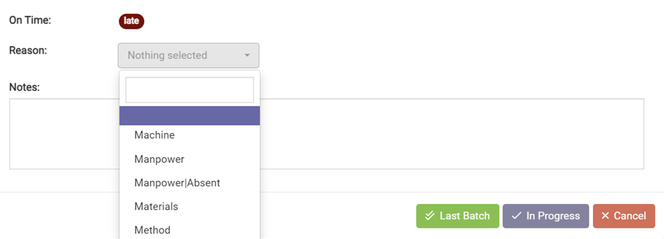
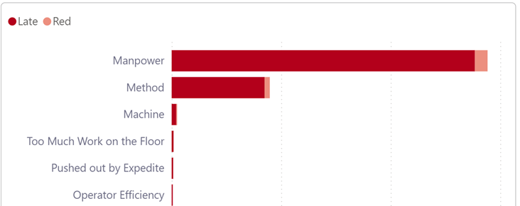
The example below is clear: we need to focus on workforce management and multi-skilling — in other words, invest in skill buffers.
This time-buffering mechanism has two advantages:
- Incorporating security into the operating model to protect promised dates
- Introducing a measurement mechanism for improvement actions
So, are you ready to master time? Let’s talk about it! Get started with DD Tech today!


